Search
In today’s fast-paced world, organizations and individuals alike face the challenge of monitoring progress, staying aligned with objectives, and reacting swiftly to changing circumstances. Visual dashboards have emerged as a key solution, offering actionable insights at a glance to help teams maintain momentum toward their targets. By transforming raw data into intuitive visuals, dashboards can bridge the gap between strategy and execution.
Whether you oversee a corporate sales team, manage complex projects, or pursue personal development milestones, the clarity and immediacy of a well-designed dashboard can be a game changer. In the sections below, we’ll explore the definition, benefits, best practices, and real-life examples that illustrate how visual dashboards empower goal tracking and drive success.
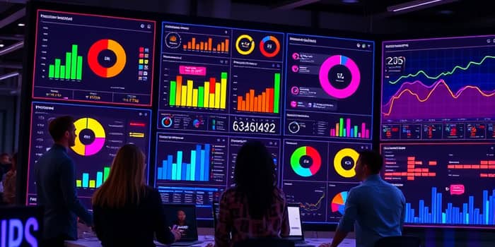
Visual dashboards are digital platforms that aggregate real-time data into charts, graphs, gauges, and tables, presenting key performance indicators (KPIs) and metrics in a consolidated view. Their primary purpose is to deliver real-time access to mission-critical data, enabling leaders and teams to assess performance instantly.
By distilling complex datasets into digestible visuals, dashboards foster a shared understanding of progress and facilitate rapid decision-making. From line charts that illustrate growth trends to heatmaps that highlight engagement levels, each element is designed to guide action and support continuous improvement.
These advantages are particularly valuable in sectors such as finance, healthcare, and technology, where conditions shift rapidly and informed choices are paramount.
Visual dashboards are versatile and can be configured to monitor a wide range of goals:
Corporate and Departmental Objectives: Revenue targets, quarterly sales quotas, market share growth, and customer retention rates can be displayed using gauge charts and progress bars to highlight performance against benchmarks.
Project Progress: Milestones, deadlines, budget utilization, and resource allocation can be visualized on Gantt-style timelines or progress trackers, ensuring teams stay on schedule and within scope.
Personal and Team Goals: Objectives and Key Results (OKRs), individual performance ratings, and team productivity metrics can be represented through bar charts, radar charts, or bubble diagrams, making it easy to celebrate achievements and identify areas for improvement.
While traditional reports have their place for detailed narratives, dashboards excel at providing instantaneous visual feedback on progress, which is crucial for agile environments.
Adhering to these guidelines will maximize the impact of your dashboard and ensure sustained engagement from users.
These applications illustrate how dashboards can be tailored across industries, proving their adaptability and power.
Despite their advantages, dashboard initiatives can face obstacles. One frequent challenge is stakeholder alignment on what to measure and why. Misaligned metrics can lead to confusion and erode trust in the tool. To address this, facilitate collaborative workshops to define and agree upon key indicators before development begins.
Another pitfall is overloading the dashboard with too much information. When users are confronted with every conceivable data point, the core message can become obscured. Combat this by applying the "less is more" principle and prioritizing the most impactful metrics.
Finally, poor data quality can undermine confidence. Establish robust data governance practices, automate data validation checks, and schedule regular audits. By ensuring accuracy, you reinforce the dashboard’s role as an authoritative source of truth.
Visual dashboards have revolutionized the way organizations and individuals track progress, make decisions, and stay aligned with goals. Their ability to transform complex datasets into clear, actionable visuals fosters transparency, accountability, and proactive management. By following best practices—designing for your audience, clarifying metrics, keeping dashboards uncluttered, and maintaining data quality—you can unlock the full potential of these tools.
Whether you’re managing enterprise-level strategies or personal development plans, integrating a well-crafted visual dashboard will empower you to monitor performance, identify trends, and adapt rapidly. Embrace the power of visual dashboards and turn your data into a compass that guides you steadily toward your aspirations.
References